My Portfolio


I like clean portfolios that navigate easily and quickly, so I made it a point to build/edit my portfolio website in a very simple, straightforward manner. So here it is!


Have a look! :)


Hand-Drawn Tee: Do Not Fret


It's been quite some time that I wanted to gift a hand-drawn tee to a friend, but never had a solid idea. As Christmas came, I know I had to crack my mind to come up with something to draw. A blank piece of paper can be the best space for imagination, and yet at the same time it can be a big problem for me - literally staring at that empty white space for hours and hours without a good idea. Until I finally gave up, I thought why not just go with something simple, yet still personal and relatable. So I thought of what he liked - music, guitar, etc. At that point, I wanted to draw a simple guitar figure with his name as a part of the guitar. So I went googling for references of guitars.

And that, was when a whole different idea came rushing in my previously blank mind - "Do Not Fret"; as in do not 'worry', as in guitar 'fret'.

Grounded with the idea, I enthusiastically started sketching a draft on paper, and then transferring it onto the blank tee shirt with my favourite Parker pencil as a rough guide. I then draw the actual design with a Sharpie in hand.

The finished drawing.

I used hand lettering for the text in the design.

Here's the finished design, labelled with a personalised tag.

:)


"Do not be anxious about anything, but in every situation, by prayer and petition, with thanksgiving, present your requests to God." - Philippians 4:6

Design: Gilead Photography Logo Design Process


"Gilead means Hill of Witness" - Gilead Photography

Designed my very first handwritten modern calligraphy logo for a dear friend Hui En, who had always been capturing the people and moments around her long before I knew her years back. And right now, it's finally the time that she embarks on her long awaited full time photographer journey!

When she explained to me about the meaning of her photography logo, it immediately connected to me because the very verse that inspired Gilead Photography's logo was also the very verse that inspired me to start off my personalised wire name jewellery on Etsy - Dazzlyn Wire back in 2012. It was Matthew 5:16, "In the same way, let your light shine before others, that they may see your good deeds and praise your Father in Heaven".

So with her vision for her logo, I started with my calligraphy nib pen and did a few hand-lettering on paper. She wanted one main logo, and another signature for watermarking photographs.

Initially, I created the two logos requested separately. But as I converted the chosen logos from sketch to digital, I made the both G's identical and fused the mountain symbol as the tail after the signature G. So instead of having two different logos, the signature G becomes a simpler version of the main logo, composing of the G and the mountain.

I used some circles to help construct a smoothly curved G, refining it a lot from the sketch. The process itself took me many hours. And oh yes, I love my workspace!
(Featuring my Blank Round Floral Stickers, Things For Today, and Kendama USA from Kendama Culture.)

Name card design: Matte laminated, with spot UV on the main logo.

The best part of design to me, is to see it come to reality - especially when I get to hold it in my hands. ;)

Special thanks to Gilead Photography!

Handmade Leather Kendama Holster


Made a leather kendama holster recently as a birthday present for Jeremy Choy, @bboyrice ! He's an amazing and inspiring portrait photographer.

The design of it was adapted from my previous holster and some reference of existing kendama holsters. I always like to personalise gifts, so I stamped his name onto it too.

Finally got some leather tools and materials to work on leather! It definitely wasn't easy to find these in Malaysia, so I bought some from Amazon.

Kendama model: Tribute by Kendama USA.


A minimalist personalized kendama holster. :)

Behind The Scenes: Hand-Painted Formal Lettering


Few days ago, I was requested by a friend to do a large sign for college. I've never done something like that before, but I accepted the challenge!

Here's the behind the scenes of the process of how I structured everything to get that formal 'printed' look!

*Doing the final touches of the painting at my workspace.

The materials given to me were a big canvas and red and white acrylic paints.

I did the design digitally and then proceeded right after my friend approved the design. I decided to print and cut the letters as I didn't have much time to sketch them by hand.

To get the right positioning and spacing of the cut pieces on the canvas, I measured the top, bottom, and sides and used a string to create my guide. Then I attached each letter until it looked good to go.

I grabbed the nearest old container around me and poured the thick acrylic in. Used a flat sponge I previously bought knowing I would make use of it one day - this is the day!

Using the cut-outs in replacement of pencil sketching, I used it as a guideline and roughly painted over the letters, touching up the excess paint later.

This is where I fill the white area with the thick white acrylic. Then, touching up with red and white paint going back and forth for about 4 times before the lines look much more crisp and straight. It is the most tedious part of the process, as every minor stroke matters.

Joy! After 5+ hours, tired but satisfied. :)


Blog: My First Sticker Swap


It's been a long time since I've heard of this online swap by Swap-Bot and I finally got the chance to participate in some of them!

Here's my first swap - Sticker Swap #3. It's an international swap and open to new members. We are supposed to send at least 20 pieces of stickers to our partner.

This is what I've chosen to give to my partner - Ruth. It consists of 4 sheets of multiple pre-cut strips and circle labels from this masking sticker set I bought (around 10 pieces of stickers per sheet), 6 animal silhouette stickers I designed, and 5 pieces of my handwritten and designed stickers.

I always loved snail mails! It is always a surprise to receive something in the mailbox with your name on it, especially when you didn't expect when you'll receive one. Hence, I like to make it special, be it just a little note or decoration. For this one, I drew a little doodle on the back of the envelope, and included a personal note to her.


Sending it with love all the way from Malaysia to Netherlands! Hope you'll like it! :)

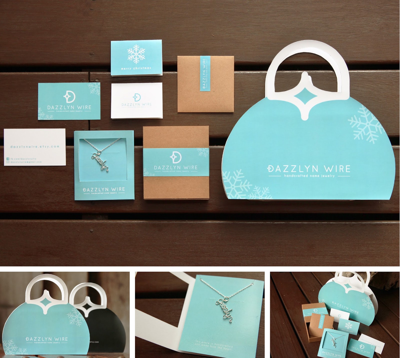
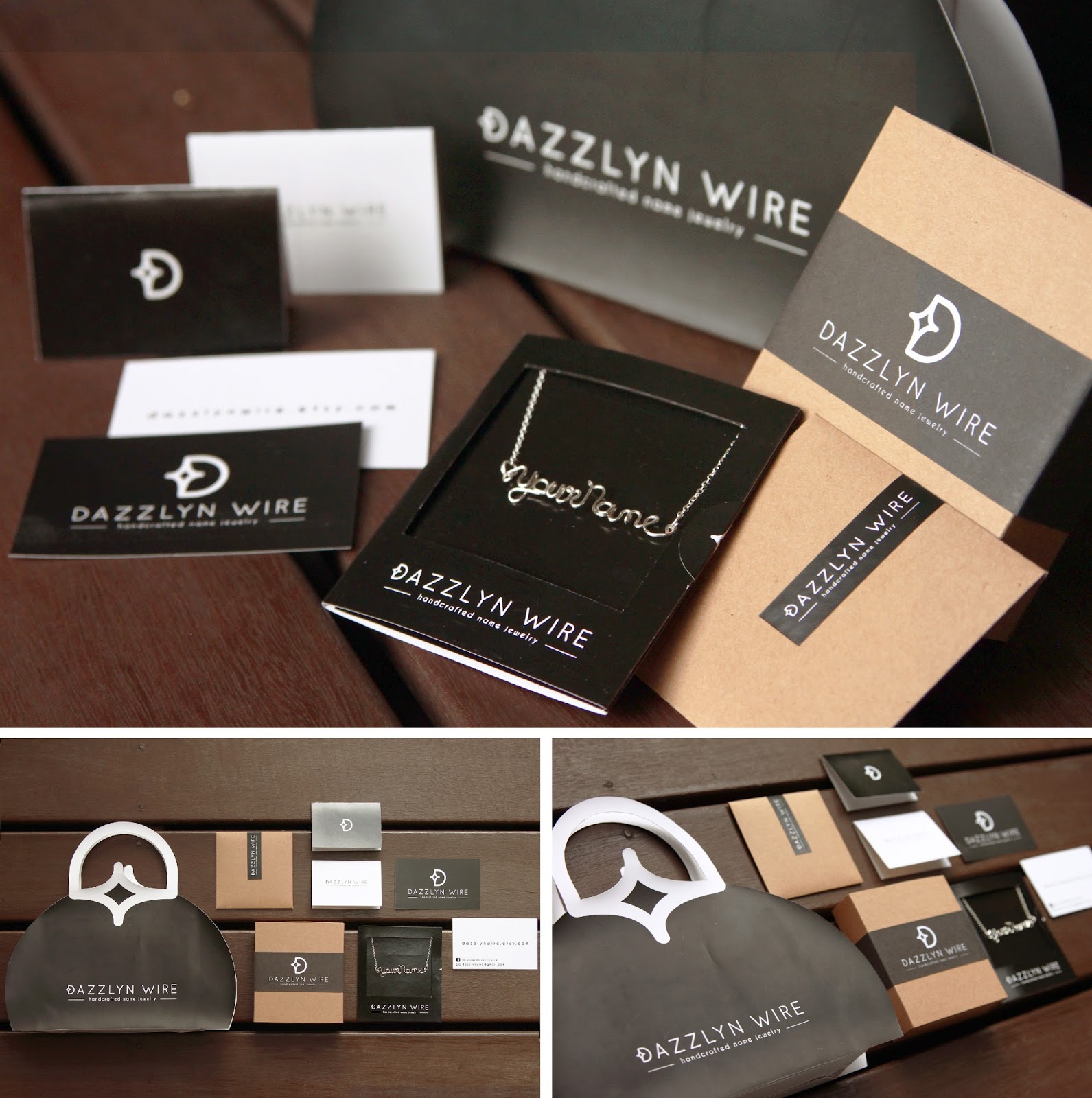
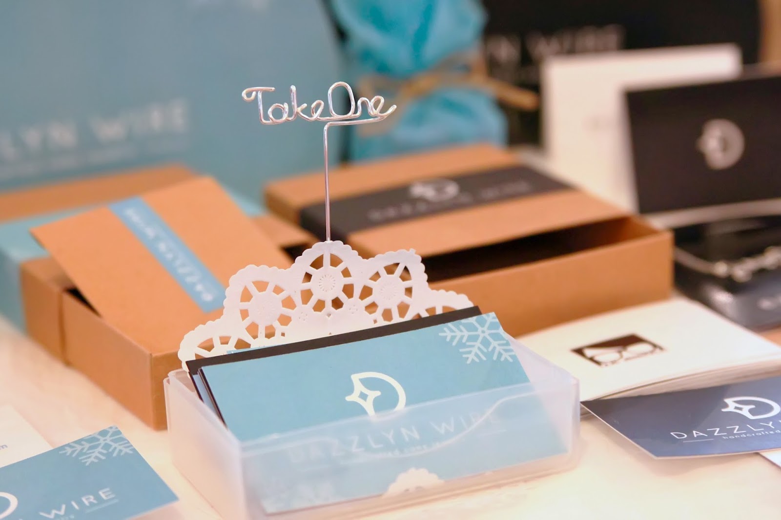
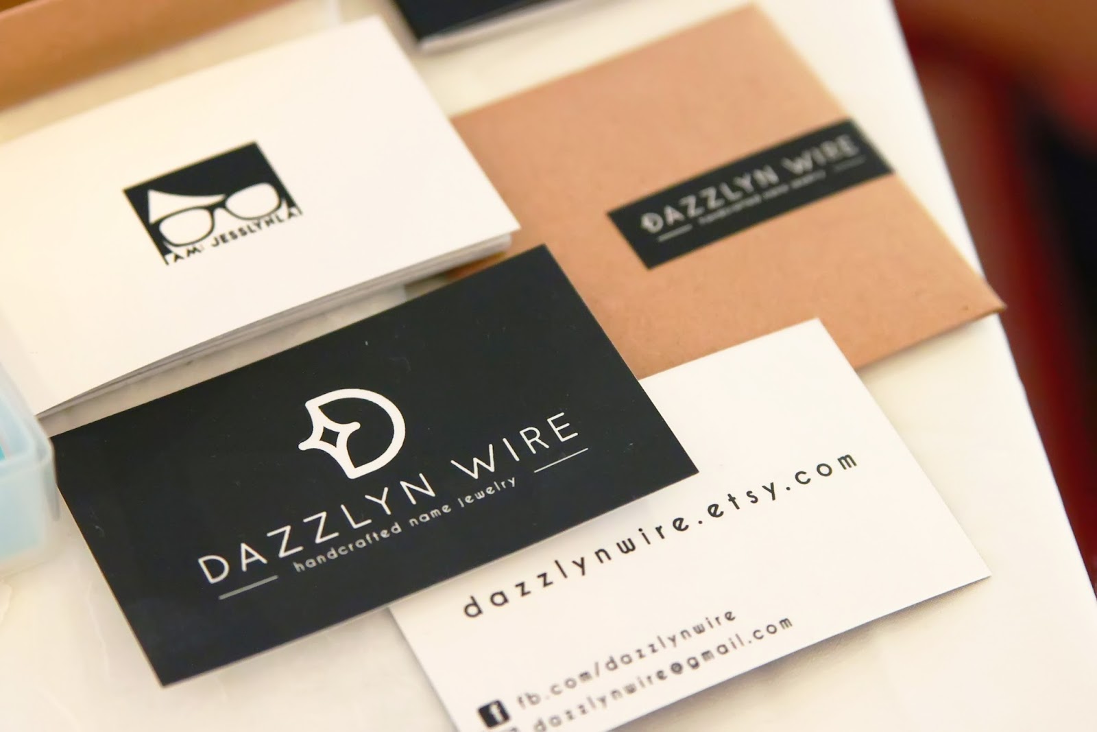
Design: Dazzlyn Wire Packaging


Dazzlyn Wire is a brand for my handmade personalized wire name jewelry on Etsy

The word 'wire' is often confused with electrical wires, and hence the more feminine name "Dazzlyn Wire" which simply means "dazzling wire creations by Jesslyn". The logo design is a "D" with a symbol of a sparkle to represent the word 'dazzling'.


100 Days Project - Update


I'll be updating my daily progress on this 100 Days Project on Facebook, Instagram and Twitter @themakerjess from now on. Do follow me! :)

I have put all pictures into a single post here. Enjoy!

---------

For this 100 days,  I will explore a different medium to express something about love. It can be a word, a picture, a characteristic, or even just a simple impression. It is an adventure of the many ways we can express creativity, and at the same time represent the many ways we can express love.

"Love - In 100 Different Media" by The Maker Jess
http://100daysproject.co.nz/project/2014/2562

100 Days Project


Day 1/100: Shadow

----------

"Love picks out the beauty in you."

It was night time when I got home and I was thinking of what I should do for my first day. Since I can't make use of daylight, I took the opportunity to make use of shadows in the night.

It is achieved by a paper doily with a heart shaped cut-out, my hands, and the torch function from my iPod Touch. And of course, some Photoshop. :)


Day 2/100: Flowers

----------

Simple things like flowers make me happy. The beauty, the sweet scent, the details.

Picked up some fresh flowers this morning. Loving the sweet floral scent when I was arranging to take this picture!


Day 3/100: Mixed Media

----------

"Love is Patient."

Pink glue textured with a layer of fine sand, a little flower from a Wrightia Religosia Bonsai plant (a.k.a. Water Jasmine/'Sui Mui'), and a broken piece of bark from an old tree.


Day 4/100: String

----------

Lettering with a string, a wooden table, and all things natural.


Day 5/100: Leaf

----------

"Love is kind"

Written on a leaf, with a leaf. No pen involved.

Nature is so good at being itself. So pure, so original, so natural. It reminds me once in a while to go back to basics. And it's amazing what the basics can do.


Day 6/100: Pieces of a Leaf

----------

Bits and pieces of Love. "Spread the love!"

I took a leaf, broke it into pieces, and put it together to form the heart shape. It was definitely a little unwilling for me to crush this beautiful leaf that was picked out and brought home for me, but the outcome is definitely beautiful and worth it!


Day 7/100: Nature

----------

"Love makes beautiful things."

A continuation to yesterday's leaf heart - added other leaves and all things nature!


Day 8/100: Hands + Origami Heart

----------

"Love gives"

Pay it forward is something I got to know about through the movie around 2 years ago, and I absolutely loved the idea! Today, a friend of mine had been blessed by not having to pay for a toll as the person in front has paid it for her. Feeling encouraged and so motivated, I challenged myself too! So I bought drinks for 2 person without telling them, and folded clothes for my mother when she was out. Two simple acts of kindness, but definitely is something! :)


Day 9/100: Pen Nib + Paint

----------

"Love always Trusts" - 1 Corinthians 13:7

First time trying to use paint instead of ink for my pen nib - worked out better than I thought! Loving the watercolor effect it gives. :)


Day 10/100: M&M's

----------

"Life is sweeter with You!"

I love M&M's. And many times, life is sweeter because of the special people around you - life's little blessings. :)


Day 11/100: Pigeon Feather + Watercolour

----------

You never know what a simple "hello" could do!

Found a pigeon's feather on the road today, so I picked it up and drew some words with black watercolour paint I mixed.


Day 12/100: Brush Pen

----------

"Hold my hands"

Played with a calligraphy brush pen and did a rough sketch of the shadow of two hands.


100 Days Project


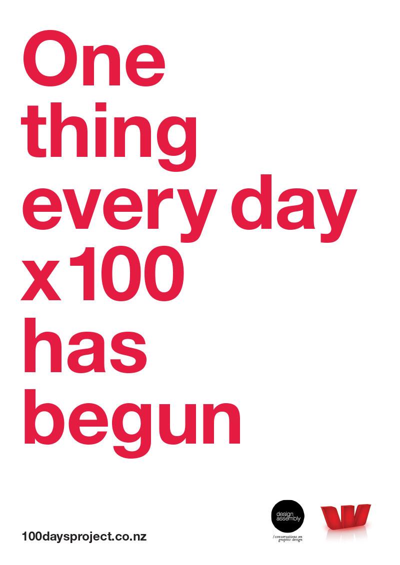
Hello! I will be participating in the 100 Days Project!

For the next 100 days, I will explore a different medium to express something about love. It can be a word, a picture, a characteristic, or even just a simple impression. It is an adventure of the many ways we can express creativity, and at the same time represent the many ways we can express love.

"Love - In 100 Different Media"
http://100daysproject.co.nz/project/2014/2562

Stay tuned!

#100daysNZ #100daysproject


All artwork + content © The Maker Jess unless stated otherwise. All Rights Reserved 2014. View terms of usage here.